| Looks like a return to the old badge 18:41 - Jun 14 with 6946 views | KeithHaynes |
Never liked it, reminds me of silver shield.
Which is your favourite ?
 |  |
| |  |
| Looks like a return to the old badge on 17:10 - Jun 15 with 1384 views | Flashberryjack |
| Looks like a return to the old badge on 12:44 - Jun 15 by Fireboy2 |
It does but do you think that they are more well known than us?
If a footy fan saw a badge of each club with no writing which team do you think they would it belonged to? |
I've already answered that question.
With regards to how recognisable other club badges are, I could spot the old Swans badge from a long way away, as I can with the wolves badge, as I can with West Ham, Spurs and many others. |  |
| |
| Looks like a return to the old badge on 17:58 - Jun 15 with 1348 views | Fireboy2 |
| Looks like a return to the old badge on 17:10 - Jun 15 by Flashberryjack |
I've already answered that question.
With regards to how recognisable other club badges are, I could spot the old Swans badge from a long way away, as I can with the wolves badge, as I can with West Ham, Spurs and many others. |
So you think that our new badge which is similar to one of our old ones looks like wycombes 🤣🤣🤣🤣 |  | | |
| Looks like a return to the old badge on 18:34 - Jun 15 with 1317 views | Plankton |
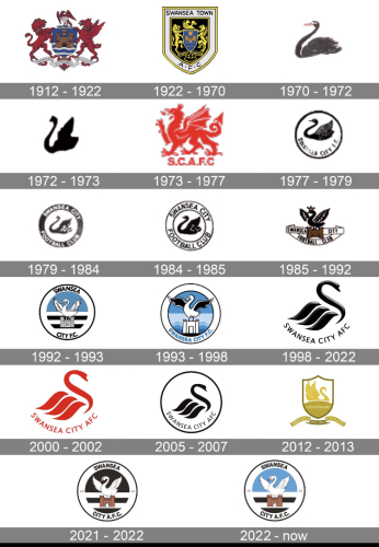
98-22 looks like sushi
HATE IT.
Classic badge with castle and swan has some cachet behind it. |  | | |
| Looks like a return to the old badge on 07:20 - Jun 16 with 1202 views | AnotherJohn |
I like 98-22. Quality graphic art as opposed to something that looks like an image from a cartoon. | | | |
| Looks like a return to the old badge on 10:12 - Jun 16 with 1168 views | whiterock |
| Looks like a return to the old badge on 07:20 - Jun 16 by AnotherJohn |
I like 98-22. Quality graphic art as opposed to something that looks like an image from a cartoon. |
When you say quality graphic art do you know that it was ripped off and plagiarised from a design someone else was using. Looks more like a rocking horse about to tip over without a circle holding it together. | | | |
| Looks like a return to the old badge on 11:29 - Jun 16 with 1147 views | mahoss |
98-22 all day long.
Some of the others are ok but 98-22 stands out.
Keep to that badge from now on. | | | |
| Looks like a return to the old badge on 14:44 - Jun 16 with 1094 views | DDCH |
Liked both, but the current new/old badge is linked to our success era |  |
| The poster formally known as DannyDyersChocolateHomunculus
|
| |
| Looks like a return to the old badge on 16:38 - Jun 16 with 1068 views | swan_si |
In order to keep everybody happy, why not sell the shirts with no badge, they could then sell the appropriate badge to the shirt buyer, and the shirt and badge buyers could sew the fking thing on themselves 😉, give the people what they want. Simples. |  | | |
Login to get fewer ads
| Looks like a return to the old badge on 18:45 - Jun 16 with 1033 views | SullutaCreturned |
1983 was my favourite. Linked to a great time as well.
TBH I never liked this "corporate" badge, which was what it was called at the time I think, modern, corporate...it was all BS. | | | |
| Looks like a return to the old badge on 20:27 - Jun 16 with 1008 views | AnotherJohn |
| Looks like a return to the old badge on 10:12 - Jun 16 by whiterock |
When you say quality graphic art do you know that it was ripped off and plagiarised from a design someone else was using. Looks more like a rocking horse about to tip over without a circle holding it together. |
It wouldn't be the first time that an excellent design that became very successful was pinched from somewhere else.  | | | |
| |