| Crest Vote on 11:33 - Dec 15 with 3851 views | JonDoeman |
| Crest Vote on 11:27 - Dec 15 by paulparker |
Why don't we just have the old one back we had before ? , fcuk all wrong with it ,
and we would save money on employing a bunch of fcukwits who don't have a clue what they are doing as well
seriously can't this club get anything right, |
Yeah , the last one was perfectly good. [Post edited 15 Dec 2015 11:34]
|  |
|  |
| Crest Vote on 11:34 - Dec 15 with 3847 views | JonDoeman |
| Crest Vote on 11:33 - Dec 15 by ozexile |
That link wont let me view them? Is it cause I'm in oz? |
No they've taken it down mate. |  |
|  |
| Crest Vote on 11:44 - Dec 15 with 3772 views | Konk |
When we got our terrible new badge, we were told we’d had to change the old one as the council owned the copyright. Turned out that was a load of rubbish and the club actually had a copyright on the badge we’d been using. Not sure if it had anything to do with Hoos, but I’m sure he was at the club at the time; just out of interest has anyone independently confirmed that there are copyrighting issues with your old badge?
From the outside, most other fans and the media refer to you as QPR and everyone knows what that stands for, so I can’t see the need for having the full name spelt out as well as having QPR. |  |
| Fulham FC: It's the taking part that counts |
|  |
| Crest Vote on 11:47 - Dec 15 with 3748 views | Juzzie |
| Crest Vote on 11:44 - Dec 15 by Konk |
When we got our terrible new badge, we were told we’d had to change the old one as the council owned the copyright. Turned out that was a load of rubbish and the club actually had a copyright on the badge we’d been using. Not sure if it had anything to do with Hoos, but I’m sure he was at the club at the time; just out of interest has anyone independently confirmed that there are copyrighting issues with your old badge?
From the outside, most other fans and the media refer to you as QPR and everyone knows what that stands for, so I can’t see the need for having the full name spelt out as well as having QPR. |
Probably for the global market. Same reason, on a massively bigger scale, why Man Utd have Chevrolet as their shirt sponsor when Chevrolet don't have any European dealers anymore.... it's not done for the domestic market. | 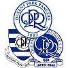 | |  |
| Crest Vote on 11:53 - Dec 15 with 3703 views | JonDoeman |
I quite like 1 , the lettering is the same as a tat I've got. |  |
|  |
| Crest Vote on 12:01 - Dec 15 with 3664 views | Konk |
| Crest Vote on 11:47 - Dec 15 by Juzzie |
Probably for the global market. Same reason, on a massively bigger scale, why Man Utd have Chevrolet as their shirt sponsor when Chevrolet don't have any European dealers anymore.... it's not done for the domestic market. |
Okay, but does it matter if someone from Seoul knows you as QPR, but doesn't know what those letters stand for? Would that really impact on your "brand" or commercials in any meaningful way? 90% of pitch side advertising in the PL seems to be in a non- Roman script these days, as we've moved on from "Dave the plumber - 226 High Road", so I understand your point re sponsors, but not sure I agree that QPR need the full name on your badge. You and WBA in England could get away without it.
We're the opposite, we came up with a badge that had our initials and no name, despite no-one knowing us by our initials. |  |
| Fulham FC: It's the taking part that counts |
|  |
| Crest Vote on 12:03 - Dec 15 with 3649 views | isawqpratwcity |
Still can't get through. Has Tony not paid the dial-up bill? |  |
|  |
Login to get fewer ads
| Crest Vote on 12:08 - Dec 15 with 3624 views | Antti_Heinola |
Oh God. The crest nightmare re-awakens.
Chances of getting a crest everyone likes? Zero
Chances of crests being designed that no one will say look like a child did them? Zero.
Chances this row will go interminably for the next 10 years? 100%
They're all fine. 1 or 2 best. Just vote and for fks sake let's move on.
Sorry, in a bad mood today ;) |  |
|  |
| Crest Vote on 12:08 - Dec 15 with 3622 views | Juzzie |
| Crest Vote on 12:01 - Dec 15 by Konk |
Okay, but does it matter if someone from Seoul knows you as QPR, but doesn't know what those letters stand for? Would that really impact on your "brand" or commercials in any meaningful way? 90% of pitch side advertising in the PL seems to be in a non- Roman script these days, as we've moved on from "Dave the plumber - 226 High Road", so I understand your point re sponsors, but not sure I agree that QPR need the full name on your badge. You and WBA in England could get away without it.
We're the opposite, we came up with a badge that had our initials and no name, despite no-one knowing us by our initials. |
Our previous badge which came out circa 1982 had both on and it's one of the most popular amongst the fans. I don't think anyone minded the last few decades that both the full name and the initials were on it. Most comments seem to be about the missing apostrophe!
 |  | |  |
| Crest Vote on 12:09 - Dec 15 with 3620 views | paesanu |
No 2 is pretty cool, though why not just have '1882' instead of 'est 1882'. | 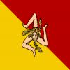 |
|  |
| Crest Vote on 12:14 - Dec 15 with 3122 views | Dorse |
Went for 1. Hate me, if you will. Fear my mighty influence. |  |
| 'What do we want? We don't know! When do we want it? Now!' |
|  |
| Crest Vote on 12:20 - Dec 15 with 3095 views | Gloucs_R |
WTF are 3 and 4?
I cant decide between 1 and 2. Prefer the one on Dave's avatar to be honest. |  |
|  |
| Crest Vote on 12:22 - Dec 15 with 3085 views | simmo |
Split between 1 and 2 but went for 2. I'd be happy with that TBH |  |
| ask Beavis I get nothing Butthead |
|  |
| Crest Vote on 12:24 - Dec 15 with 3076 views | Rs_Holy |
| Crest Vote on 12:08 - Dec 15 by Juzzie |
Our previous badge which came out circa 1982 had both on and it's one of the most popular amongst the fans. I don't think anyone minded the last few decades that both the full name and the initials were on it. Most comments seem to be about the missing apostrophe!
 |
the one above gets my vote! |  | |  |
| Crest Vote on 12:26 - Dec 15 with 3064 views | BromleyHoop |
I don't like the lack of options we've been given. It should have been like the recent vote for a flag for New Zealand; about 25 different options from a variety of sources. I wonder if we're paying a design consultancy and if so how much. A competition to create the best design would cost nothing. |  |
|  |
| Crest Vote on 12:36 - Dec 15 with 3028 views | LowerloftLad |
I'm liking option number 2 |  |
|  |
| Crest Vote on 12:37 - Dec 15 with 3022 views | FDC |
No 2 all day long for me. 3 and 4 are a bit of a mess hey? |  | |  |
| Crest Vote on 12:38 - Dec 15 with 3010 views | isawqpratwcity |
| Crest Vote on 12:08 - Dec 15 by Juzzie |
Our previous badge which came out circa 1982 had both on and it's one of the most popular amongst the fans. I don't think anyone minded the last few decades that both the full name and the initials were on it. Most comments seem to be about the missing apostrophe!
 |
Finally got through.
They are all much, much better than Flabbio's current effort. If it's got to be one of those four, then the 2nd is my clear choice.
But when it comes down to it, the one in Juzzie's post above is pretty near perfect. |  |
|  |
| Crest Vote on 12:39 - Dec 15 with 2768 views | Dorse |
| Crest Vote on 12:26 - Dec 15 by BromleyHoop |
I don't like the lack of options we've been given. It should have been like the recent vote for a flag for New Zealand; about 25 different options from a variety of sources. I wonder if we're paying a design consultancy and if so how much. A competition to create the best design would cost nothing. |
Paying a design consultancy? Based on what we've been offered, I'd say we paid for crayons and a pair of scissors.
Dan Thingy (the guy that did DaveB's avatar, him) did better and I'd have had no problems with any of his designs. The club missed a trick there.
Apologies to Dan and all the members of the Thingy family for forgetting their names. |  |
| 'What do we want? We don't know! When do we want it? Now!' |
|  |
| Crest Vote on 12:40 - Dec 15 with 2766 views | hopphoops |
3 and 4 - spaghetti hoops.
2 for me. |  |
|  |
| Crest Vote on 12:47 - Dec 15 with 2726 views | eccles |
1 and 2 are basically the same but with fonts from different eras.
3 and 4 are basically the same but one of them has a nipple on the top.
This has been going on for ages! Can we just get on with it?
Pick 1 or 2, (2 gets my personal vote) and move on.
the sooner we get rid of the current abomination the better.
Incidentally, I'd love to know how much this actually costing? You can bet your life that some marketing/graphic design company is charging our club a small fortune for all this "work"
we should be told! Sort it out! |  | |  |
| |